Comics aren’t just for the little kids! With the growth of graphic novels, even our older students feel like comics are their “level.”
In this activity, students create comic strips focused on target vocabulary.
This allows teachers to see if the student can use the vocabulary appropriately in context.
It’s a fun, effective activity. Let’s find out exactly how to use it!
? How to Use Comic Strip Vocabulary
Students use target vocabulary in a comic strip. The end.
It really is almost that simple, but there are some things to know.
There are a few extra tricks for digital, but I’ve got you covered on that, so read on.
This is one activity where the real work is done by students, which is … fantastic.
You can either let students select the word or you can select the word.
You can also make it randomly selected by having a group of target words from which they choose. The students then take the word(s) and include those in natural sounding vocabulary in a comic strip.
The one warning I would give is that students struggle sometimes to sound like people would actually speak. You need to warn them about that!
Let me show you how to set it up.
?
How to Set Up Comic Strip Vocabulary
To do this activity, you’ll need two things: comic strip layouts and target words.
You make your own comic strip layouts or you can buy them on sites like Teachers Pay Teachers. I create my own in PowerPoint, usually.
I may need an intervention about how much clip art I get on TpT, but I just love making my stuff look fun! I make them really simple, as you can see in these examples:
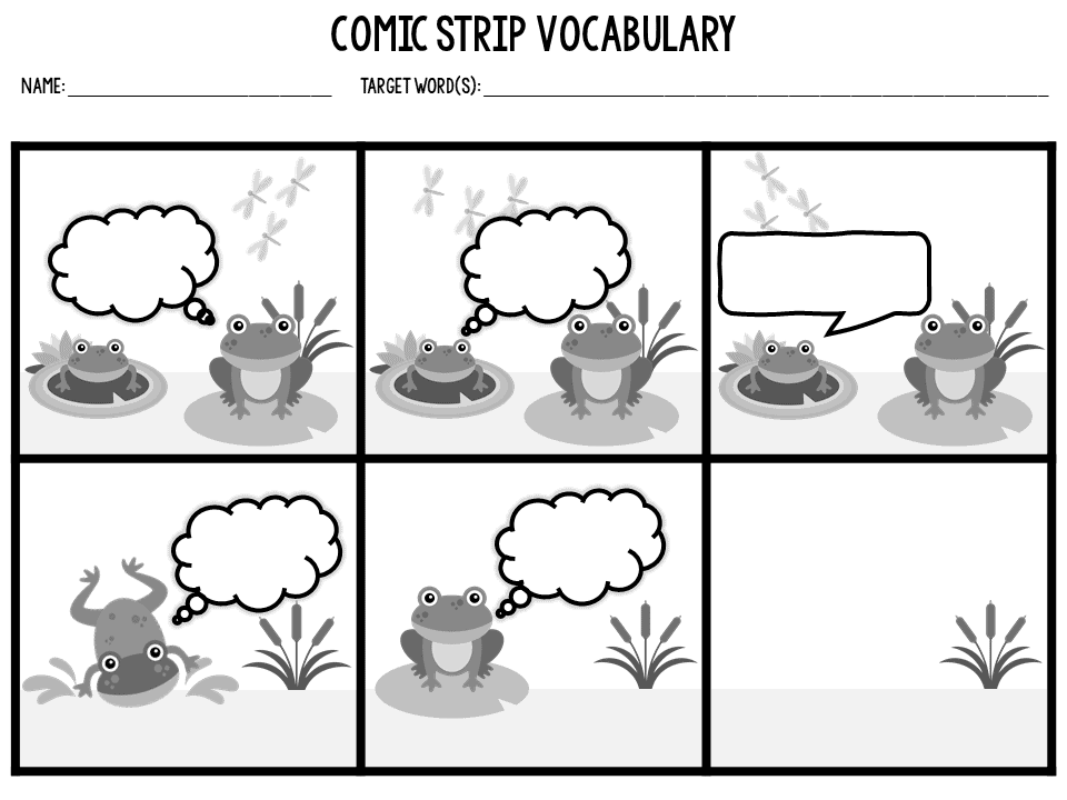
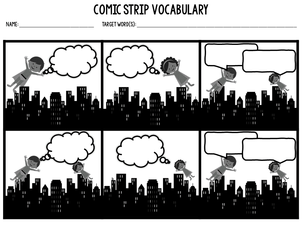
I prefer to give students the layout with the characters and speech and thought bubbles already done.
I find that if you have the layout ready like that, it saves tons of time. When students create the characters, it takes much longer.
That’s fine when you’re using a digital tool (see below), but for analog, they can get too caught up in that and neglect the actual purpose of the activity.
? Digital Comic Strip Creation Tools
There are a number of comic strip creation tools on the web. I’m sharing the ones that I like because they are free and make a good platform for teachers/students.
There are other platforms, and if you want to pay for it, you can. But you don’t have to, as these ideas show.
Make Beliefs Comix
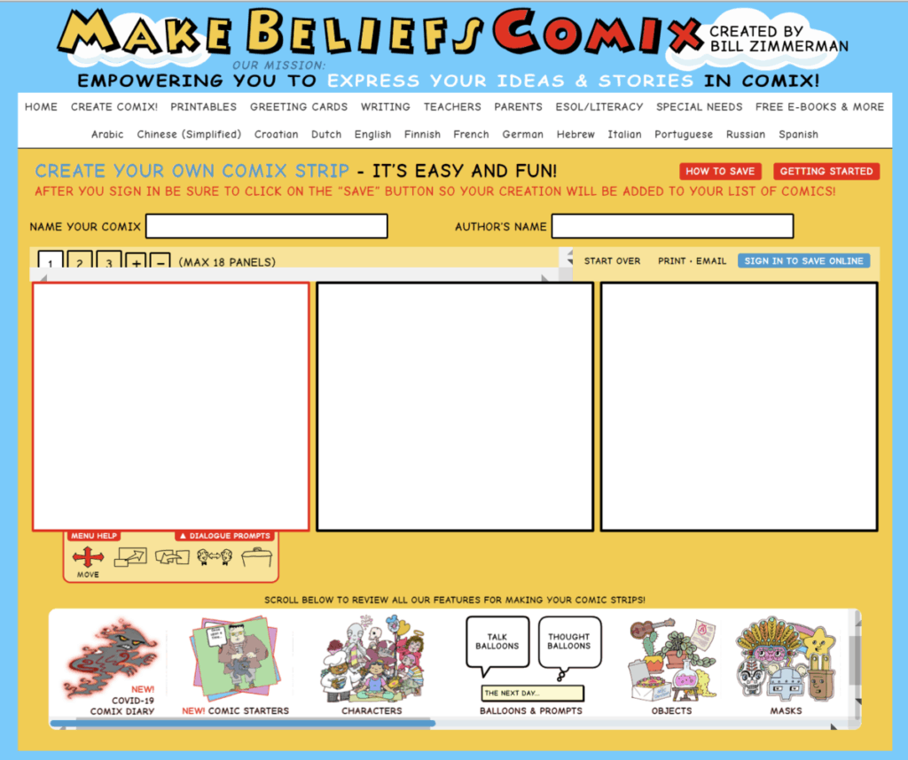
This free site (accepts donations) is a super page!
There are loads of possibilities here, including lesson plans, so even if you don’t use it for vocabulary comic strips, I think you’ll find it an awesome site to use.
Storyboard That
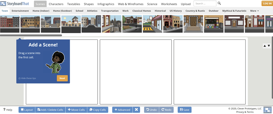
This tool is a little more sophisticated, and I like that it has scenes.
If you teach secondary students, this may be a perfect choice for you, as it yields a very pro result.
It’s a freemium model (free, but has a paid version), so if you find you use it a lot, the paid version might be worthwhile.
I’ve never had that, so I don’t know if it’s worth it.
There’s lots to love in the free version. Promise.
Canva
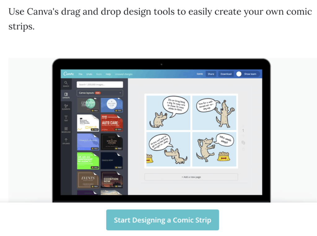
Canva has lots of templates in its comic strip creator section.
I have the pro account with Canva, but even in the free version, there is a lot.
I think this is best for secondary students because it’s not as obvious.
Canva gives a pro look, and I’ve used this one the most of all of them.
Highly recommend!
? Using in Google® Classroom
If you want to use this activity in Google Classroom, you can save the layout you create in PowerPoint as a background on a Google Slide.
You can add a textbox on top of that and have students fill those in.
I made two quick videos to show you how I do that. To start, you need to save the layouts you want to use as JPEGS or PNG files.
Here’s how you do that:
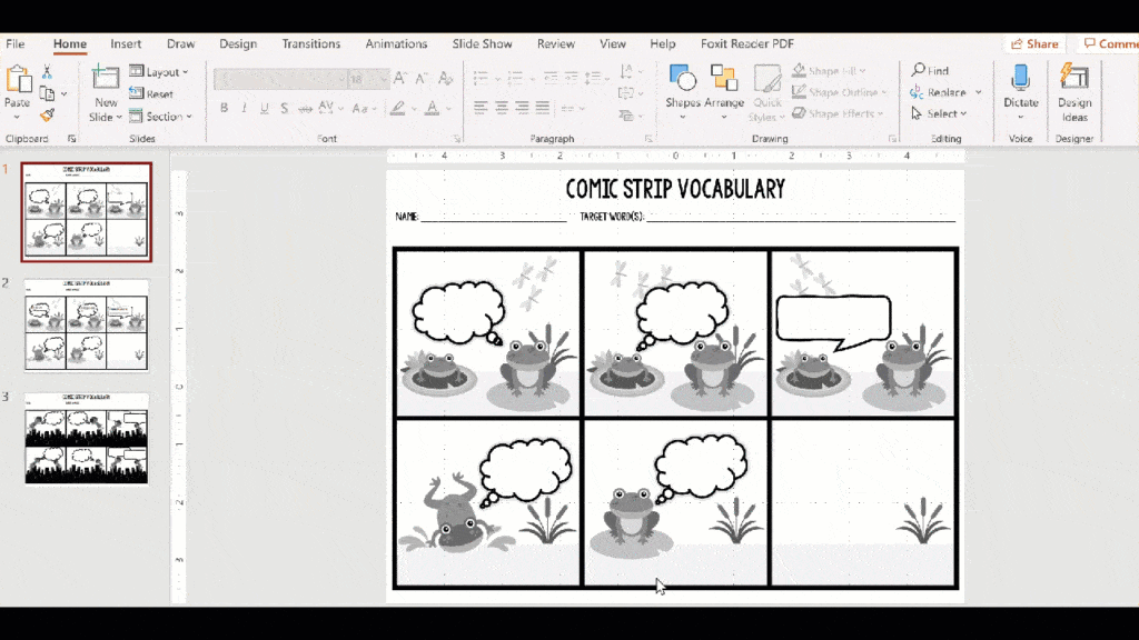
Step-by-step it looks like this:
File > save a copy > PNG
I choose all slides, but if you only need one, you can do that, too. This will save a copy of all of your slides as PNGs in a folder.
Next, you need to change the background of your Google Slide.
Here’s the video:
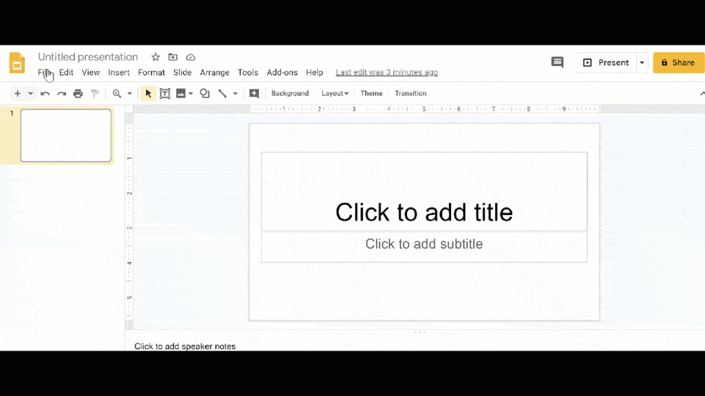
Here are the steps:
First, I change the page set up to the right aspect ratio to match the size of the slide.
If you created in widescreen in PowerPoint, the default will work. I create to fit a piece of paper, so I choose Standard 4:3.
File > Page Set Up > Standard 4:3
Next, I choose Slide > Format Background > Choose Image
I pull the image I created. In the video, I’d put the image on my desktop to make it fast, but normally, I just navigate to the folder I saved.
You can see in the video how I can no longer drag the picture around. It can’t move.
It’s not shown in the video, but then I just insert text boxes for kids to fill in.
? Differentiating the Comic Strip Activity
The instinct is to have advanced students use more target words, but that’s not differentiation: it’s moreferentiation.
Instead, have them work with more sophisticated, advanced vocabulary.
Alternatively, you can give them additional constraints by telling them a scenario they have to use.
Constraint is an underused differentiation strategy.
For instance, in this strip I use, I could tell them that they have to write the strip as if the superheroes are enemies…or siblings…or best friends… or….
As the teacher, you can create the scenarios in ways that make the activity more or less difficult by:
- Having more or fewer speech/thought bubbles
- Having more or fewer frames
- Adjusting the number of characters
- Making the scenario and context more or less obvious
Give struggling students some scaffolding by adding in some fill-in-the-blank support with some of the frames like in this example:

? Why the Comic Strip Vocabulary Activity is Worth Trying
As I mentioned before, this activity allows you to tell if your students have strong ownership of the word because you can see them use the word in context (or not!).
Additionally, it allows students to use their imaginations. It’s super fun to see them use the words in ways I never expected but that work really well.
It’s a good activity when you need something to hang in the hall. I know that may sound silly, but sometimes you just need to have work to display. #teacherlife
One thing I like is that there’s a lot of room in this activity for students. They can make it complicated or simple. They can use color to enhance it.
It’s also flexible in that it can be printed or digital, which means that you can adapt for lots of scenarios.
It’s really one of the few things that truly work equally well in both ways.
? Wrapping Up:
While simple, this activity is worth having in your repertoire.
If you purchase the layouts or have students create them digitally, the prep is very, very low (all you need is the vocabulary words).
Sometimes it’s hard to bring vocabulary to life in a visual way, and this allows for that. This will be a favorite of some of your students, while others won’t like it as well. That’s okay – not everything can be the favorite.
What makes it worth it is how much insight it will give you into how deep the students’ understanding of the word is.
I hope you try it!?
